Northwind Heating & Cooling
Residential HVAC Service & Installation — Minneapolis, MN
Website concept created for portfolio demonstration. Not built for a paying client.

The brief
Northwind is a family-owned HVAC company serving homeowners across the Twin Cities. The site does two jobs at once: it has to route a panicked homeowner to a phone number in seconds, and it has to build enough credibility for a five-figure system replacement. The layout, copy, and visual hierarchy are tuned for both.
Capture 24/7 emergency calls with a one-tap dial in the header
Build credibility for higher-ticket installs with certifications and warranty proof
Surface financing options early so price is not a silent objection
Convert one-time service customers into monthly maintenance plan members
Built to convert visitors into customers
Sticky emergency-service banner with click-to-call
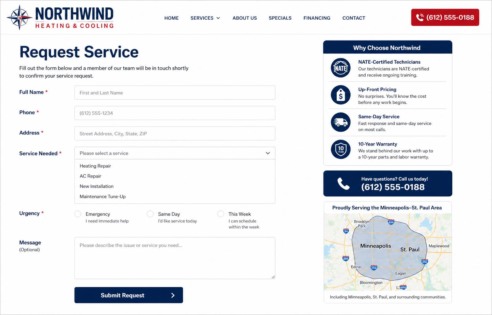
01Service request form with urgency triage (Emergency / Same Day / This Week)
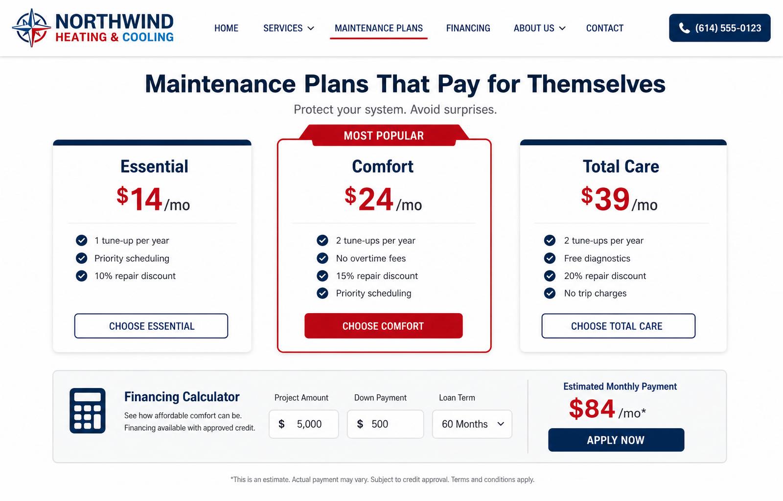
02Three-tier maintenance plan pricing with feature comparison
03Financing calculator that shows an estimated monthly payment
04Trust block covering NATE certification, warranty, and up-front pricing
05Service-area map covering Minneapolis, St. Paul, and surrounding suburbs
06What changed, and why it matters
Phone number buried in a footer block
Sticky 24/7 emergency banner with one-tap dial across every page
No certifications, warranties, or financing mentioned above the fold
Trust row with NATE certification, 10-year warranty, and 0% financing
Maintenance plans mentioned once on a buried services page
Dedicated plans page with comparison pricing and a financing calculator
Fast where it counts — on a phone
Hero photo preloaded and served as a responsive image set
Mobile score on a simulated 4G connection
Down from 2.7 MB on the previous WordPress build
Every decision points at the form
A pretty site is not the goal. The job is to turn visitors into booked, qualified leads. These are the deliberate choices we made to make that happen.
Emergency banner stays pinned so a panicked homeowner is one tap from a phone call
Service request form triages by urgency so the dispatcher knows what to route first
Financing calculator surfaces the monthly payment before price ever becomes an objection
Maintenance plan comparison places the recommended tier in the middle to anchor the choice
Looks sharp on every screen
More than seven in ten local-service visitors land on a phone. The layout, type sizes, and tap targets are tuned for that reality first, then scaled up to the desktop.
- Emergency call button uses a tel: link and a large red CTA on mobile
- Service request form uses native dropdowns, radio groups, and date pickers
- Financing calculator switches to a stacked layout under 480px so nothing is clipped
- All photography served as responsive AVIF to keep mobile data usage minimal
Screenshots from the build
Built with a modern stack
Want a site like this for your business?
Tell us about your business and we'll put together a tailored quote — no obligation, no pressure.
Request a Free Quote

