Showroom Mobile Detailing
Mobile Auto Detailing — Twin Cities, MN
Website concept created for portfolio demonstration. Not built for a paying client.

The brief
Showroom is a mobile detailer serving homeowners and dealerships across Minneapolis and Saint Paul. The site is built around one job: turning a curious visitor into a booked appointment in under sixty seconds. Clear packages, real photography, and a short booking form replace the cluttered, price-shopper layout common to the category.
Position Showroom above discount detailers with a premium, confident look
Make booking the primary action on every screen — no buried contact pages
Communicate the at-home convenience of mobile service up front
Justify higher pricing through quality of imagery, copy, and proof
Built to convert visitors into customers
Hero with service-area check and a one-tap quote button
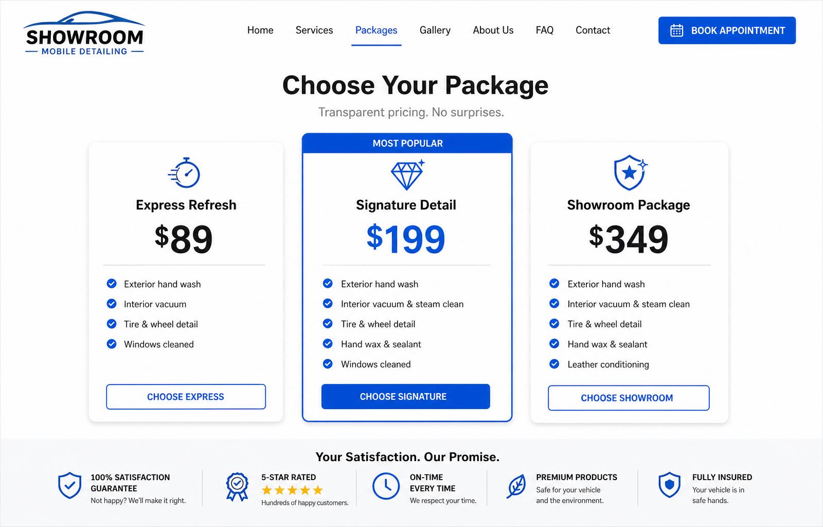
01Three-tier package pricing with a highlighted recommended option
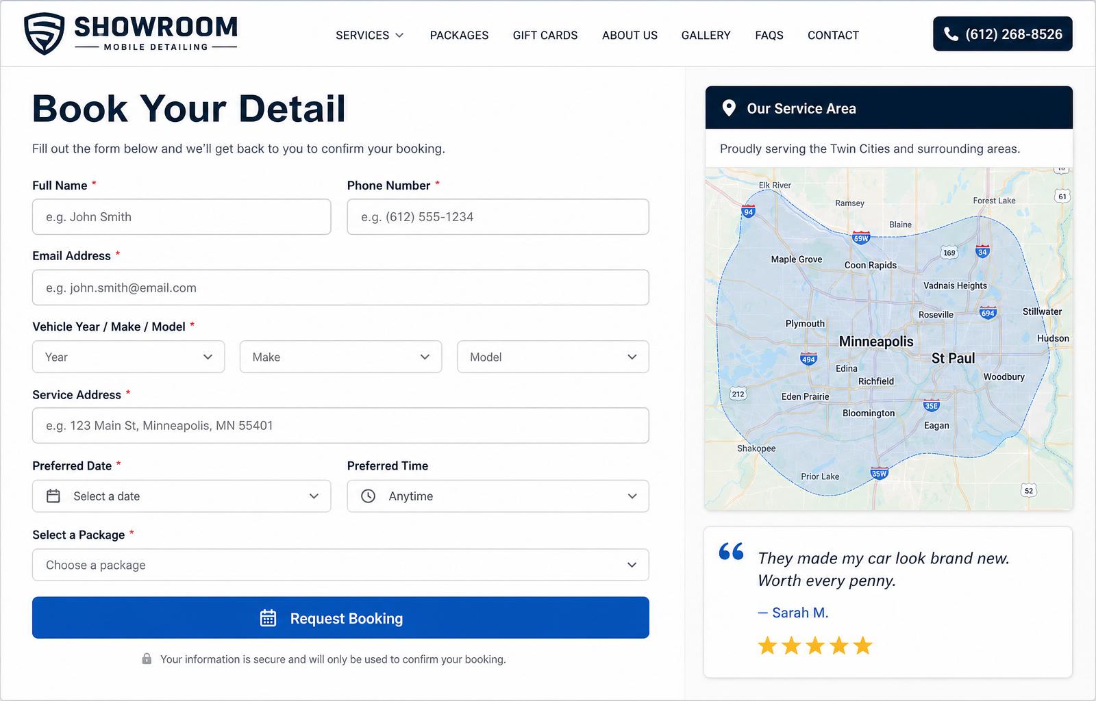
02Booking form that captures vehicle details, address, and preferred time
03Service-area map covering the Twin Cities metro
04Customer reviews pulled from Google with verified ratings
05Sticky click-to-call bar on mobile for fast contact
06What changed, and why it matters
Stock photos, generic 'We Detail Cars' headline, no pricing
Real work photography, one promise, packages and a quote button in view
Contact form buried two clicks deep with eight required fields
One-screen booking form pre-filled with the customer's package selection
Two recycled testimonials with no names or ratings
Live Google review block with verified 4.9-star average
Fast where it counts — on a phone
Hero image preloaded and served as a responsive AVIF/WebP set
Mobile score on a simulated 4G connection
Down from 3.1 MB on the previous site
Every decision points at the form
A pretty site is not the goal. The job is to turn visitors into booked, qualified leads. These are the deliberate choices we made to make that happen.
Pricing visible on the home page so visitors do not bounce to a competitor for an estimate
Booking form reduced from twelve fields to six, with smart defaults for time and package
Sticky mobile quote bar so the primary action is always one thumb-tap away
Social proof block placed directly above the form to counter last-second hesitation
Looks sharp on every screen
More than seven in ten local-service visitors land on a phone. The layout, type sizes, and tap targets are tuned for that reality first, then scaled up to the desktop.
- Hero, packages, and booking form all fit within two thumb-scrolls
- 44px minimum tap targets across every CTA and form field
- One-tap dial and one-tap text-message links in the header
- Photos served at exact rendered size to keep mobile data under 500 KB
Screenshots from the build
Built with a modern stack
Want a site like this for your business?
Tell us about your business and we'll put together a tailored quote — no obligation, no pressure.
Request a Free Quote

